Making learning interactive
An interactive kids' music class for kids 0-6.
songs for seeds, an interactive kids' music class for children 0-6, provides an engaging learning environment where kids sing, dance, and rock out with a live band. Music is the medium, but interactive learning is the goal. songs for seeds teaches concepts from phonics, rhythm, and world music, to letters, numbers, and animals through a series of interactive songs and games. For the songs for seeds team, I re-designed the website and user experience of their site to better reflect the needs of their audiences.
Target audience
The main audience for the class itself was parents who wanted to give their children an interactive and multidisciplinary education. One of the challenges songs for seeds faced was showcasing that the class was interactive and multidisciplinary, not just a standard music class.
In addition to class participants, songs for seeds also wanted to attract future franchise owners. With 20+ franchises across the country, the team knew that it took a unique type of candidate to foster a songs for seeds business - parents who wanted ownership over their jobs and lives, flexibility to spend time with their kids, and a love for nurturing young minds.
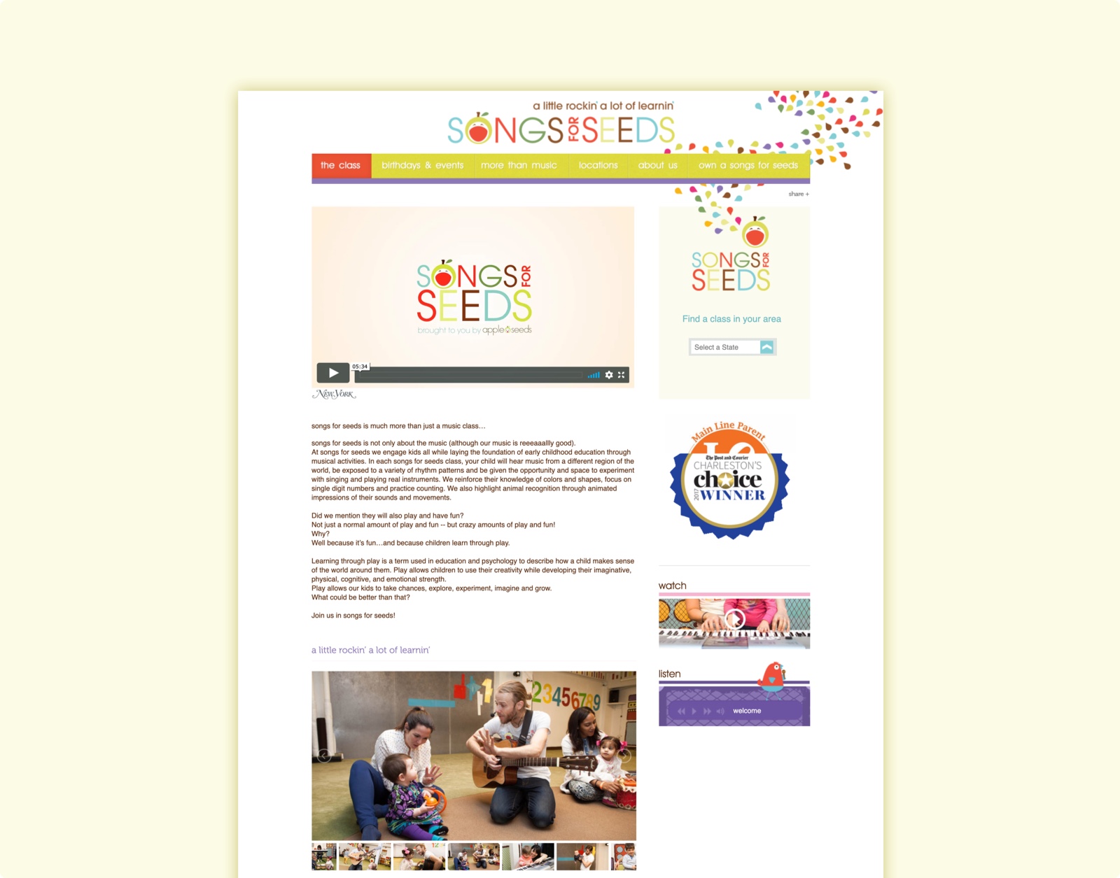
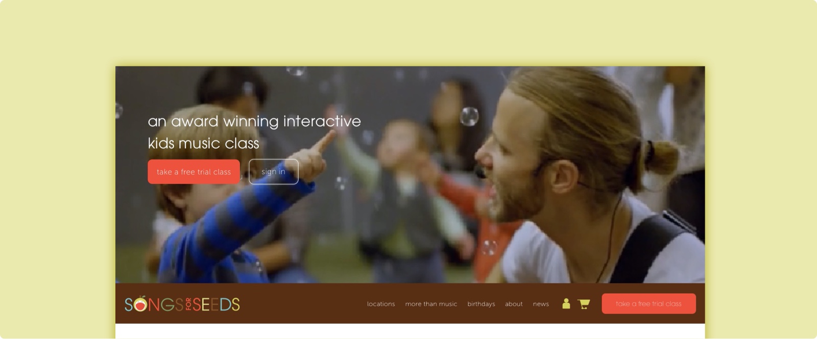
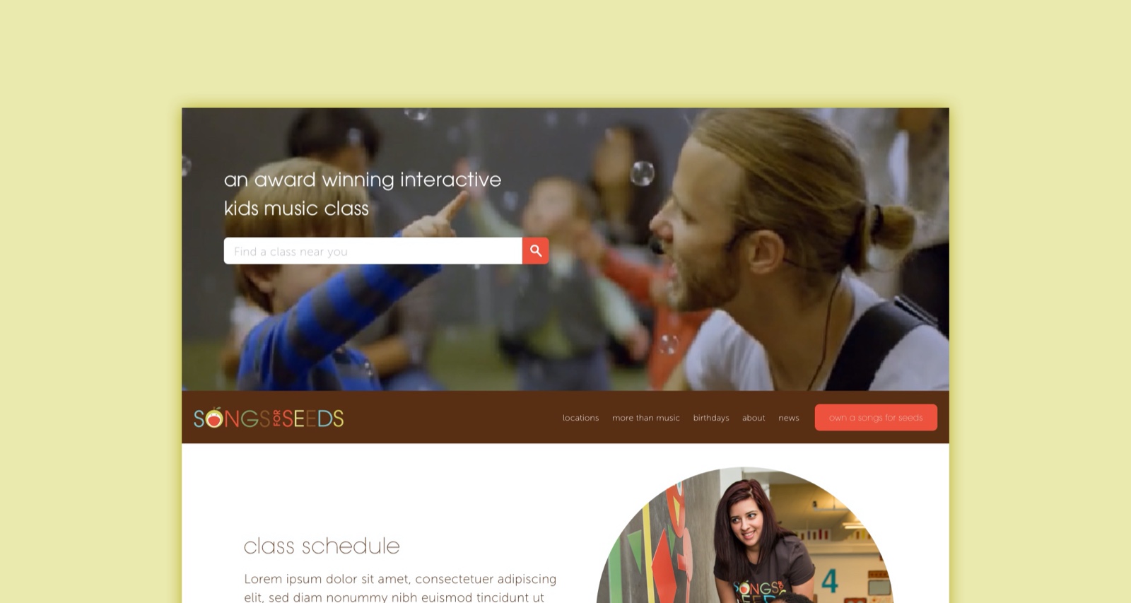
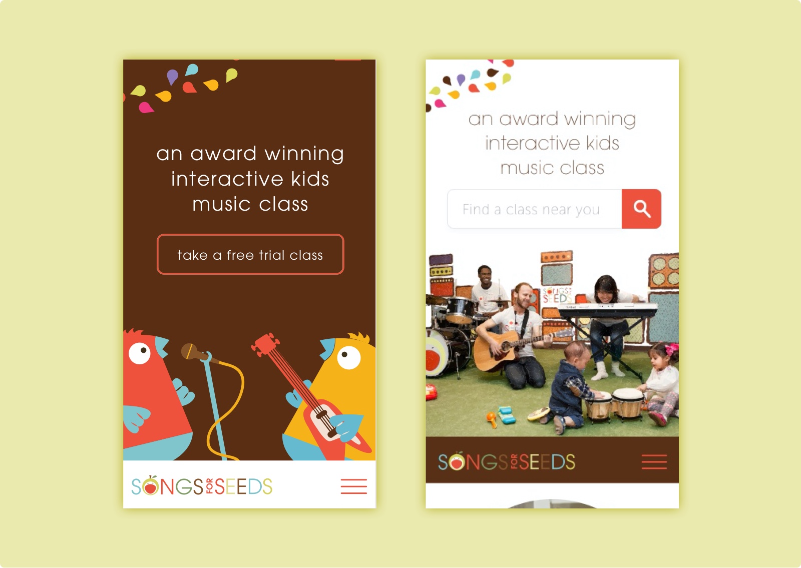
The image below depicts the original songs for seeds landing page, where a user must click to see the video of the class. There is no overarching headline and CTA in the hero space and there is not CTA to become a franchise owner. In order to communicate to the right audience, songs for seeds needed to refine their message and restructure their content hierarchy.
Highlighting the class
To understand how songs for seeds could approach improving their user experience, increasing their class enrollment, and attracting new franchise owners, we looked to our competing and neighboring educational programs and franchises.
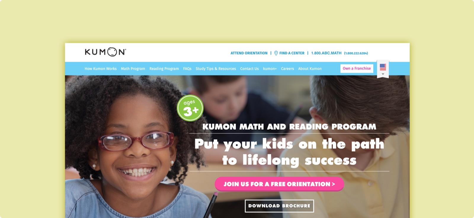
In Kumon, an international student prep program, the class pages were depicted with a single header image of a happy child. While happy expressions on a focused character were certainly tried and true in advertising, we did not favor this approach for songs for seeds because it was difficult to highlight both the children and the live band. And despite a breadth of available class photography, the classroom scenes were often too complex to be suitable for website images that needed to be paired with copy. They would overshadow headlines or clutter the page. To simplify this depiction, we chose to move in the direction of describing the class with motion. Similar to what the existing site contains, excerpts of the video would be the backdrop of the site.
Attracting future franchise owners
The second challenge we needed to tackle was making owning a songs for seeds franchise appealing on the main site. While a sales funnel sister site at songsforseedsfranchise.com was doing plenty of the heavy lifting here, most leads were coming in through Facebook advertising instead of the songsforseeds homepage. This meant that the existing userbase of parents who already knew and loved the class and valued the community, were untapped.
Assessing the existing songs for seeds site through Google analytics, we found that the “franchise” link had a low CTR, meaning users were scrolling right past in without a second thought. To address this issue, we updated the language to include a CTA and gave the “franchise” link its own space outside of the main navigation.
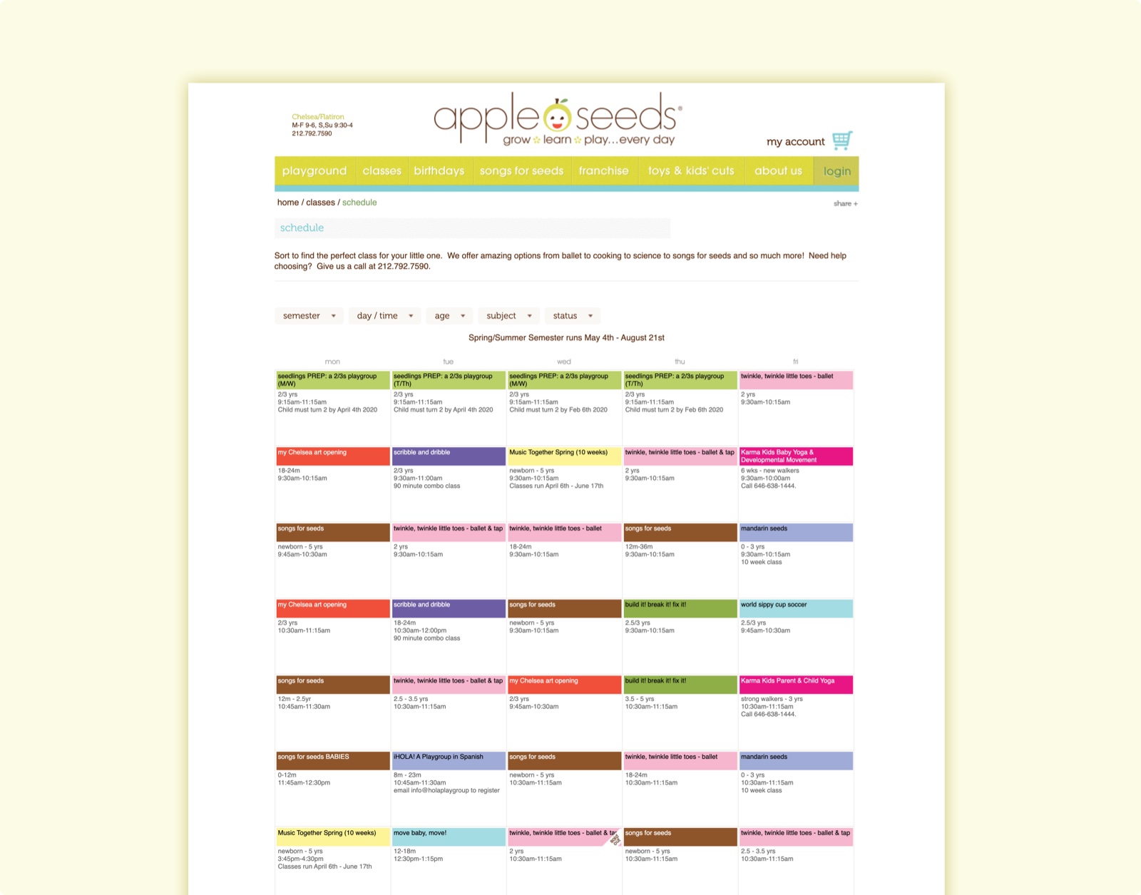
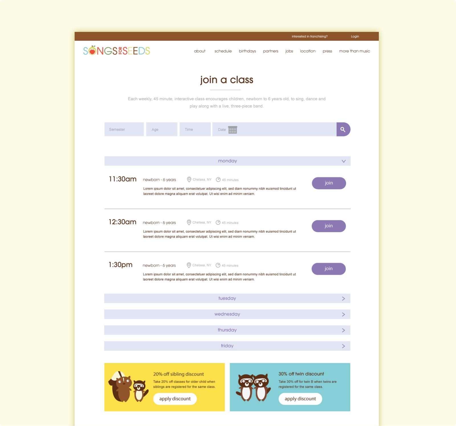
Improving class registration
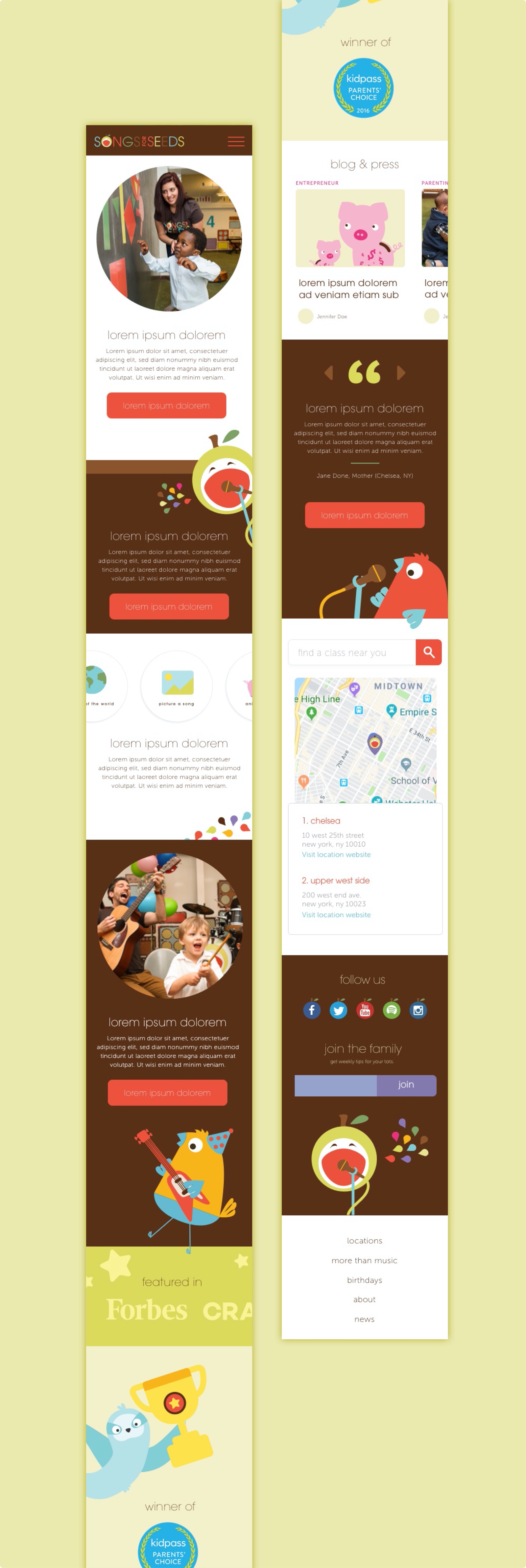
Simplifying the landing page would help us better funnel users to the registration process. However, once they were there, we needed to simplify the existing calendar-style registration as well. To improve this experience, we created a simplified flow in which users could scroll through the classes in a single day by date. This created room for additional information, as needed, for each class. And it improved readability, as the content was grouped in a single top-down format.
Franchise owner feature requests
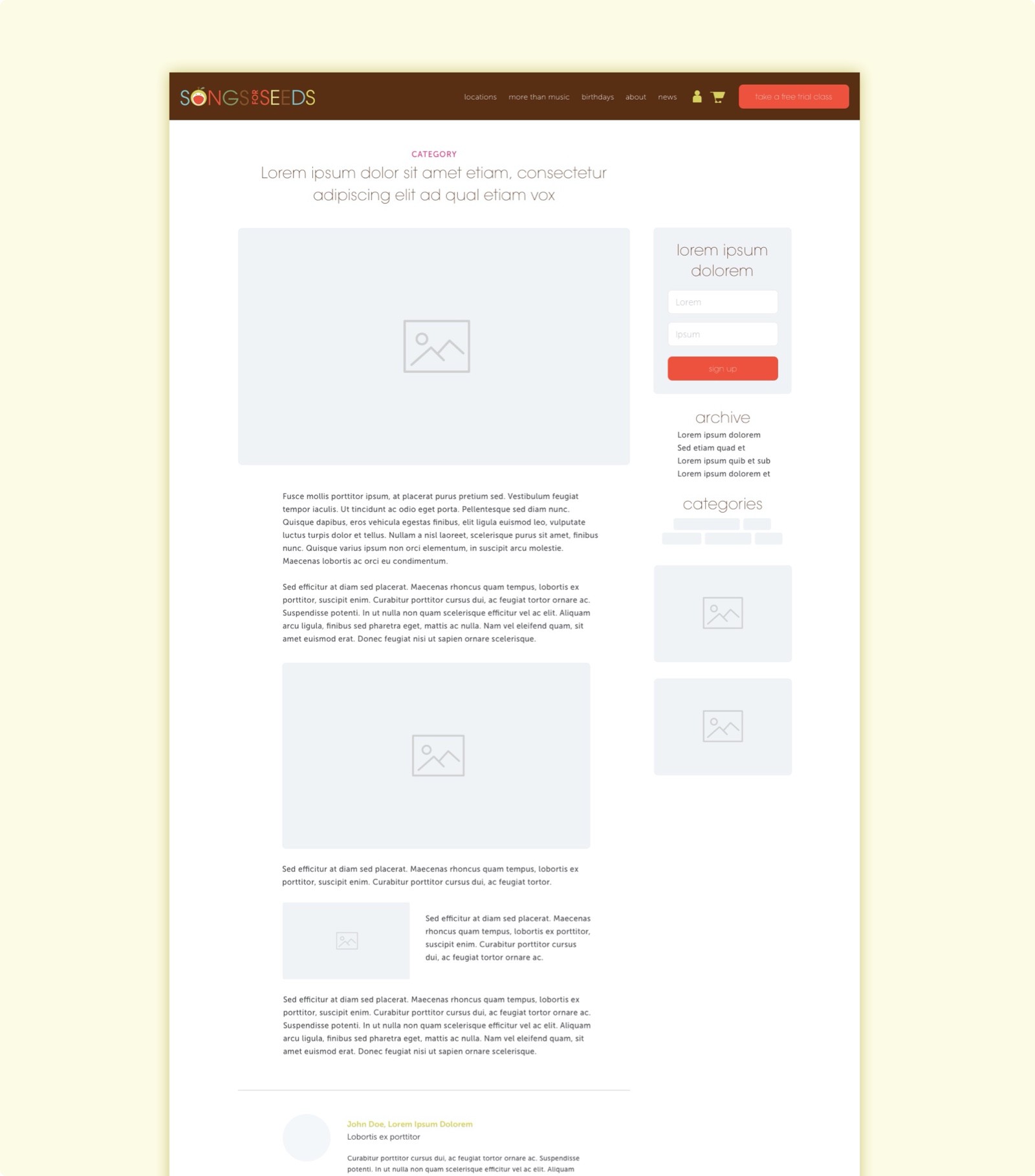
In addition to addressing aspects of the site that deterred users from finding the information they needed, we also wanted to make sure we were internally listening to the voices of existing franchise owners. They wanted more control over their sites. More options for customization.
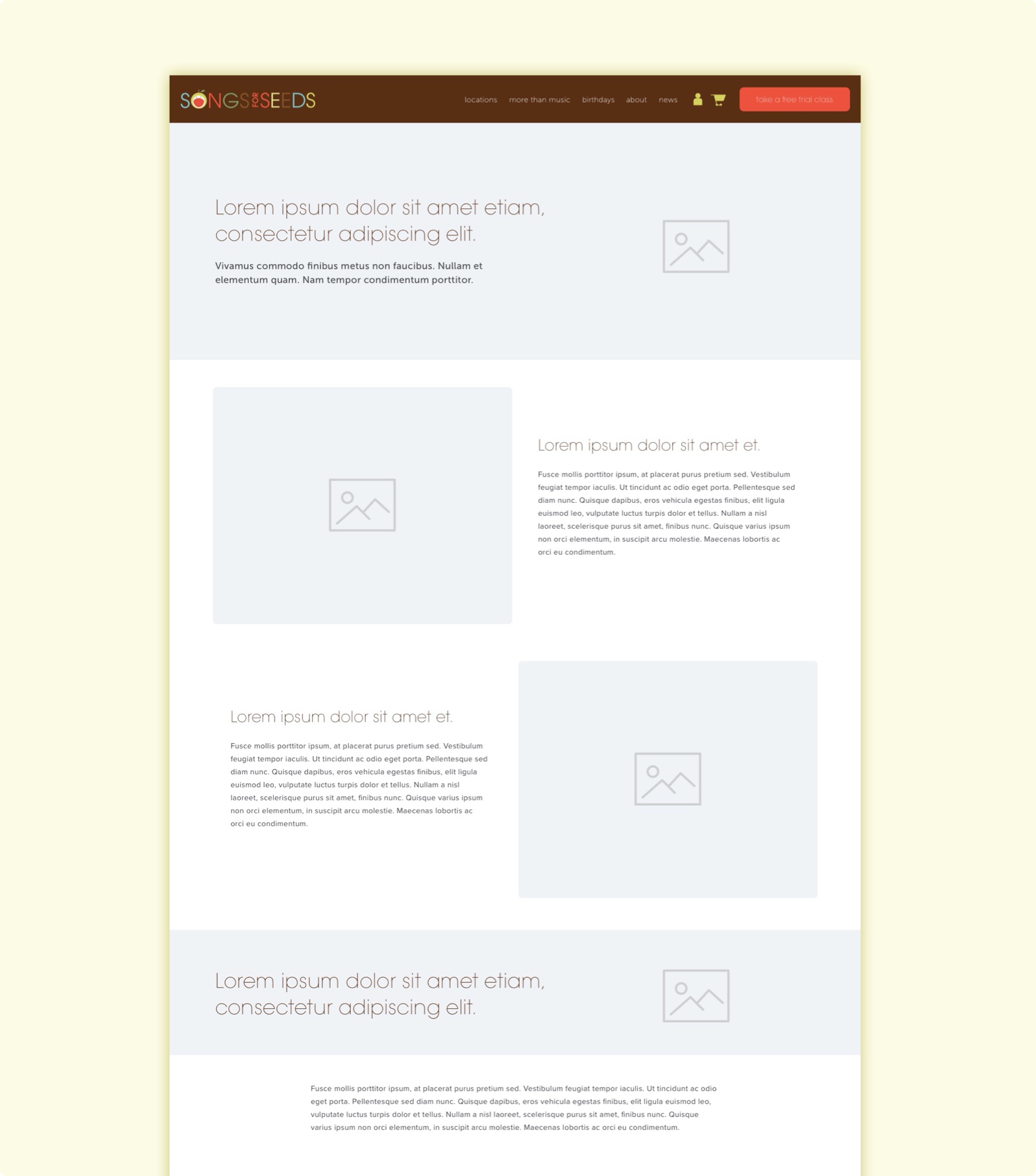
The wireframes below depict a custom blog layout, as well a more intensive feature - the ability to create custom page layouts for individual franchise sites. The latter introduces a wysiwyg template where franchise owners would be able to drag and drop their own layouts and manage their own copy. The ability to manage so many varieties of copy and ensure that the language is on-brand may prove tedious to manage as the franchises grow in numbers. And while this feature is not a pressing one as part of the first round of our redesign, it is on the table as a potential future for songs for seeds franchises, where franchise owners can easily edit content for their sales information, events, and more.
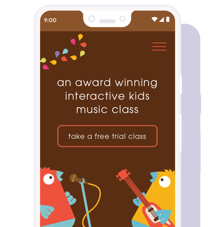
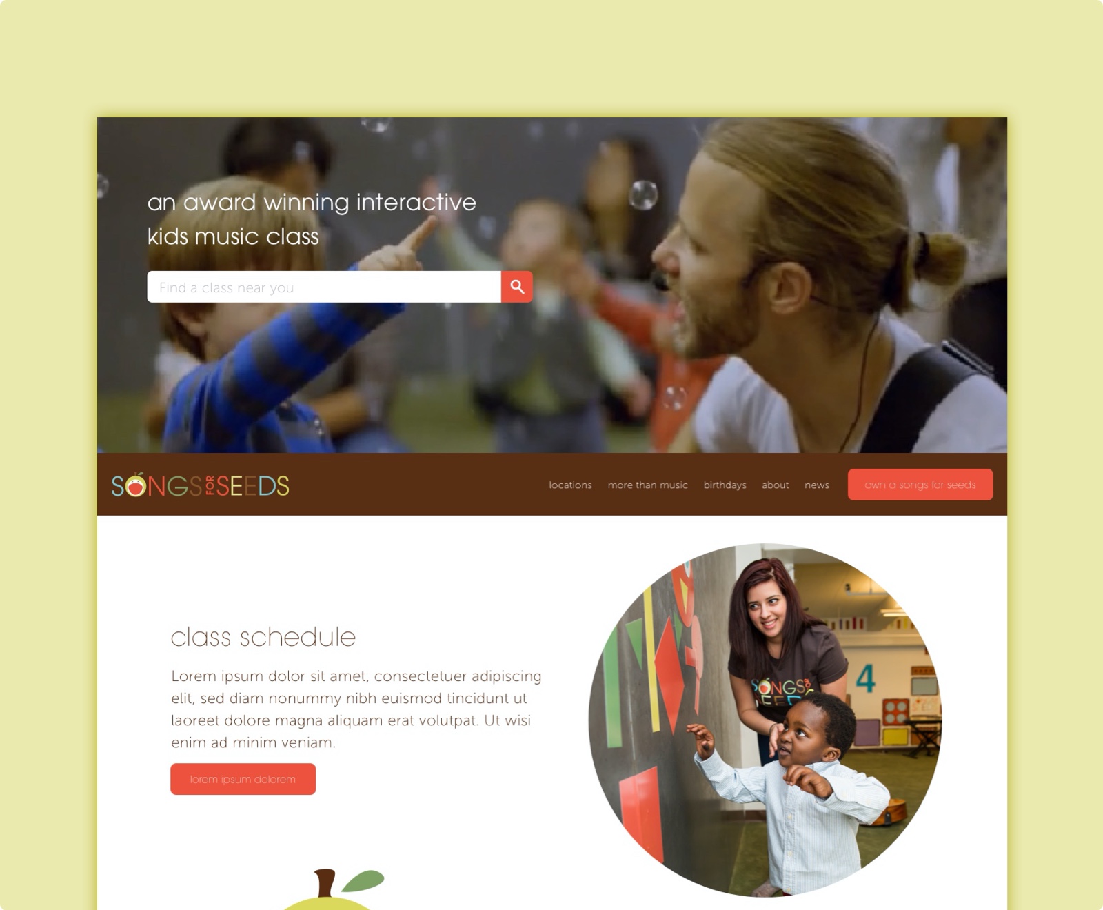
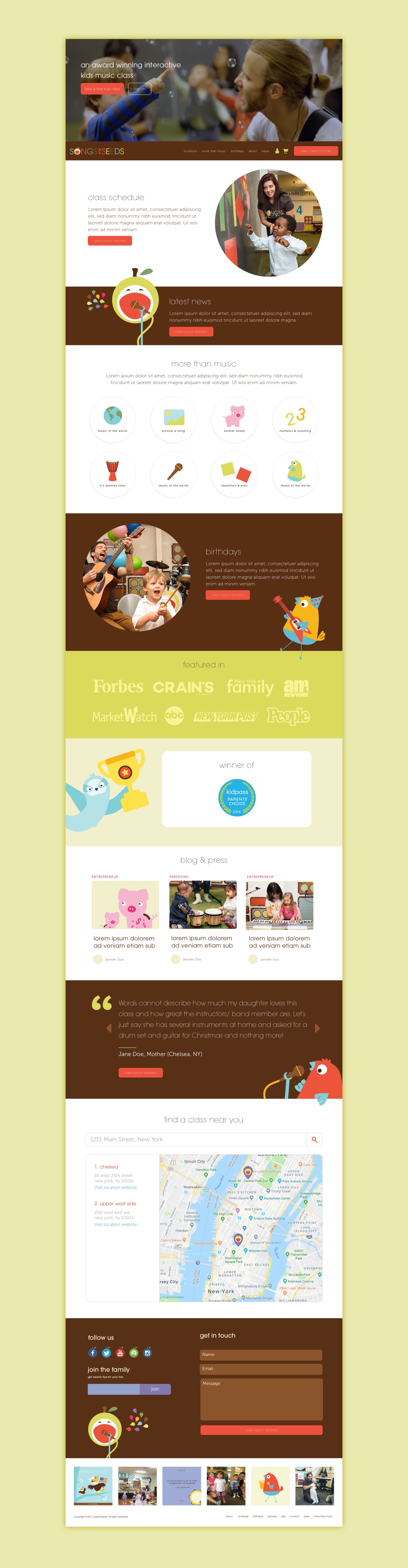
Bringing it all together
The final design is depicted below. In addition to addressing songs for seeds’ two main business concerns in the hero and navigation sections, we also reformed the content hierarchy of the landing page to better highlight the features of the class and additional offerings. Parents needed to be able to find the class schedule to register. But it was also important to highlight that songs for seeds offered private birthdays and events where the band could be hired.
Looking forward
Once this iteration of the songs for seeds redesign launches, we will be looking for improvements as well as what’s not working, relying on tracked analytics data to support our decisions. Some questions we will consider: To what extent have registrations and franchise CTR increased? Has the quality of franchise candidates improved by pooling from class registrants vs. users from advertisements? Have the common registration or franchising questions customer service regularly receives changed?
