Making mortgages simple
An anxiety-free process for mortgages and refinancing.

Shopping for a new home or planning a home upgrade is fun, but shopping for a mortgage or refinancing one is often a chore filled with paperwork and anxiety. Eon, a Northbrook IL based group, gives home buyers an anxiety-free mortgage and refinancing process. For their team, I re-designed the brand, content hierarchy, and site user experience.
Targeting a niche
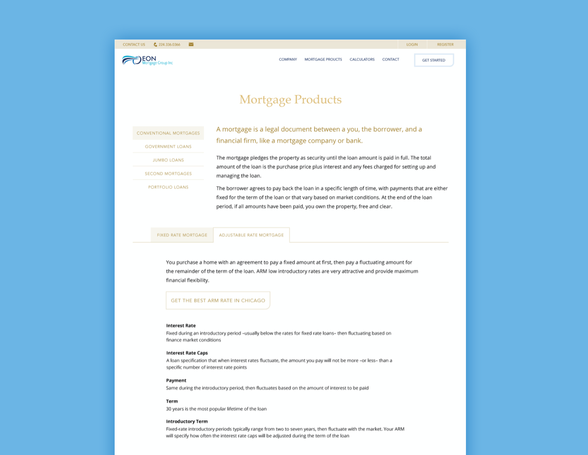
One of Eon’s key targets was first-time home buyers. In order to maintain engagement with these buyers, they needed to ensure that the long daunting form processes often accompanying online preapprovals and refinancing services were as simple and easy to read as possible.
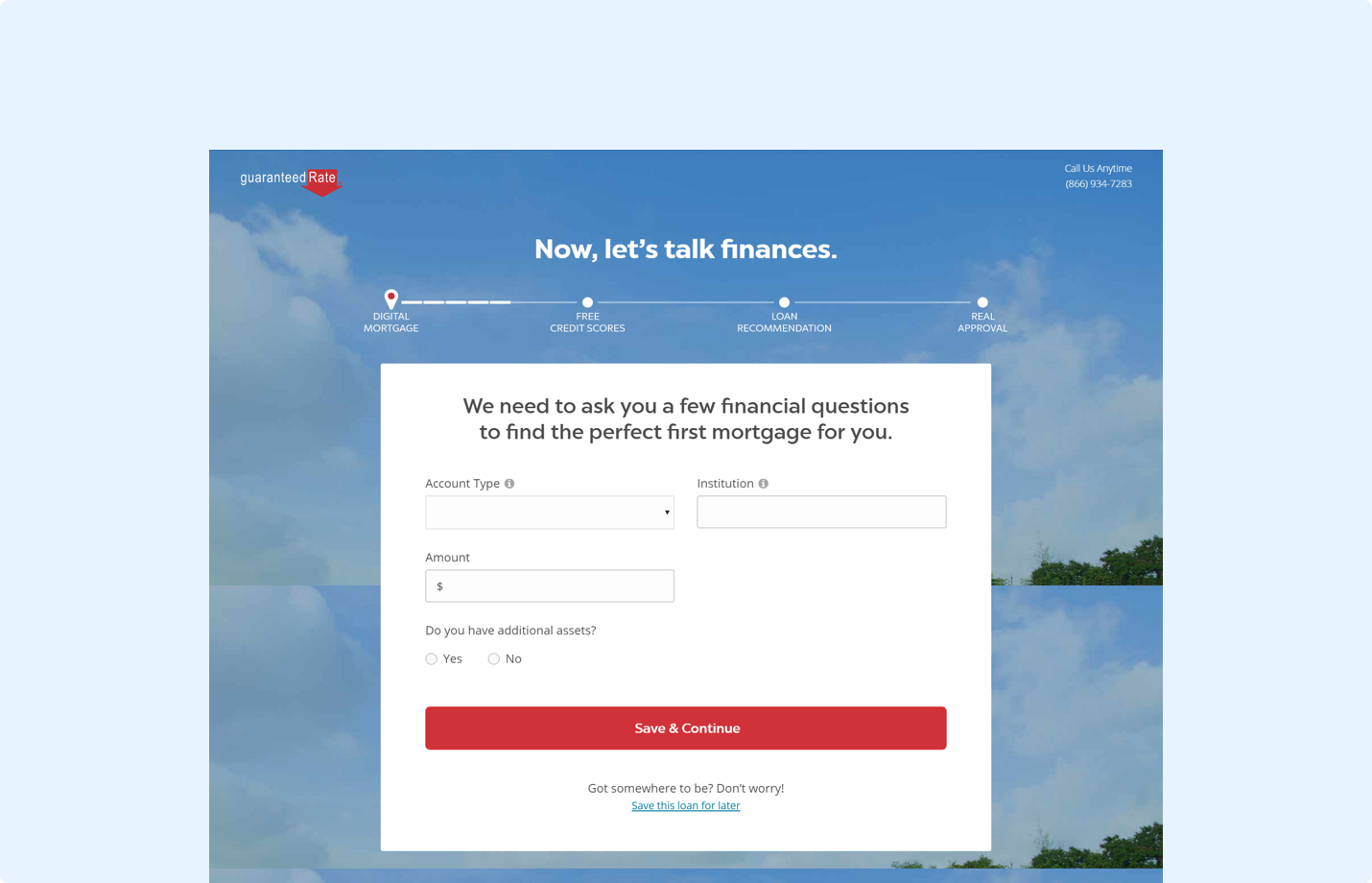
To best understand how we could achieve this and improve the process, we analyzed top and local mortgage services, such as guaranteedRate and bankRates. Many of the competitors we explored had straightforward landing pages and informational pages. However, they skimped when it came to online forms, having 10+ screens in a form flow and using verbiage that first-time home buyers may not be familiar with. Eon aimed to simplify this process with simple language and streamlined online forms.
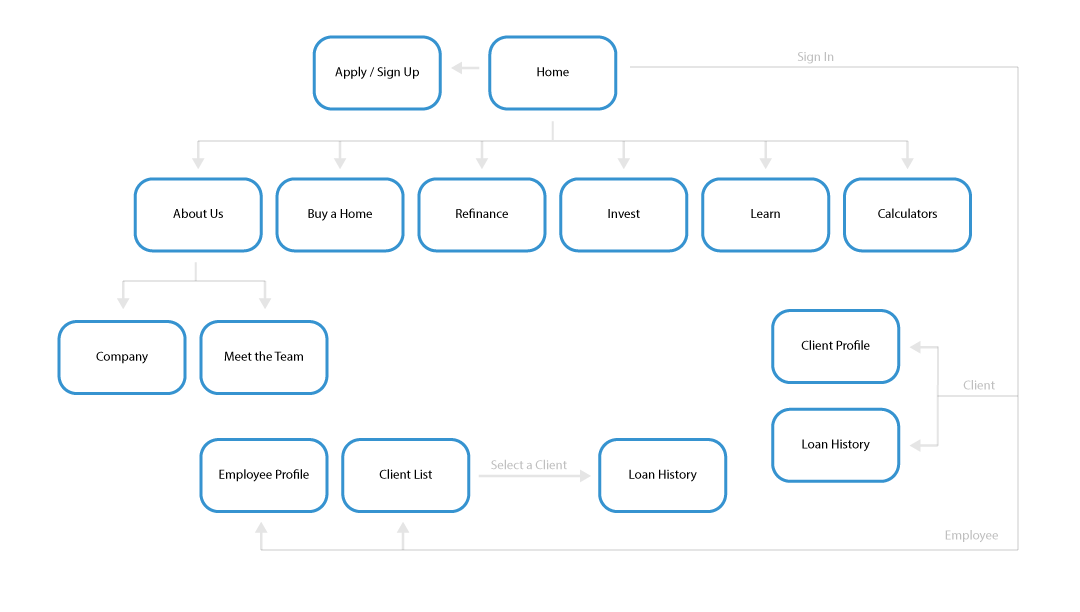
Defining the architecture
For ease-of-navigation, we create a single main CTA, while highlighting the process that users would undergo after getting started. The sitemap below depicts a simple information architecture that reflects Eon's goal of making mortgages simple to learn about.
Conceptualizing the brand
Eon wanted to create a brand that didn't feel as corporate and transactional, but still educated the user on the core elements needed to begin financial assessments and empowered them to understand and make decisions for themselves. They wanted to voice their services in a welcoming and easy to understand manner.
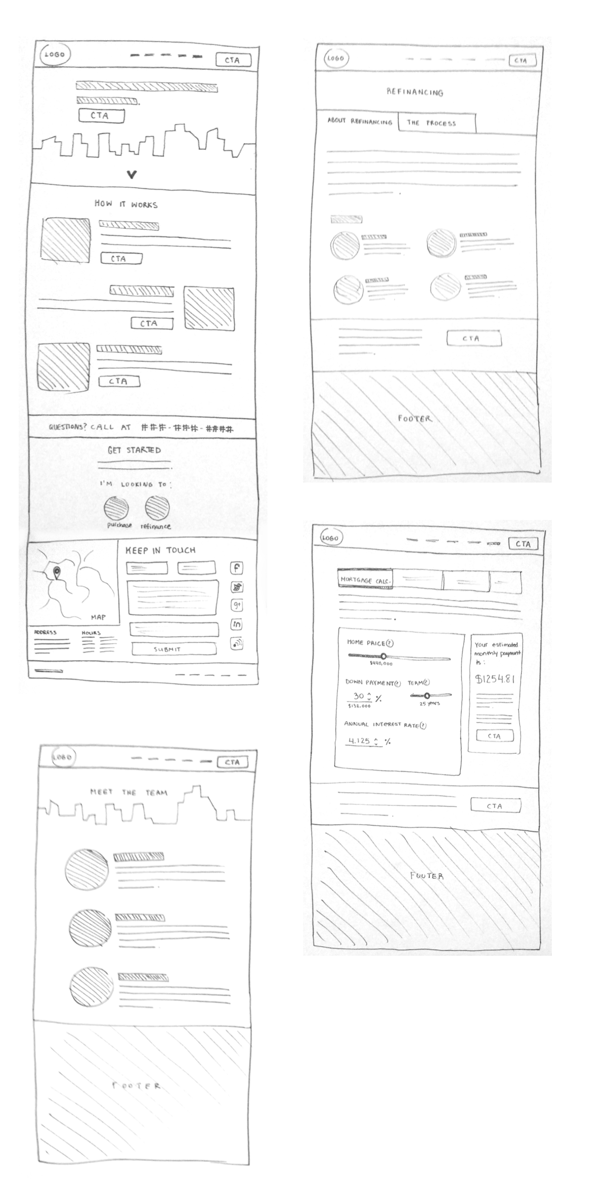
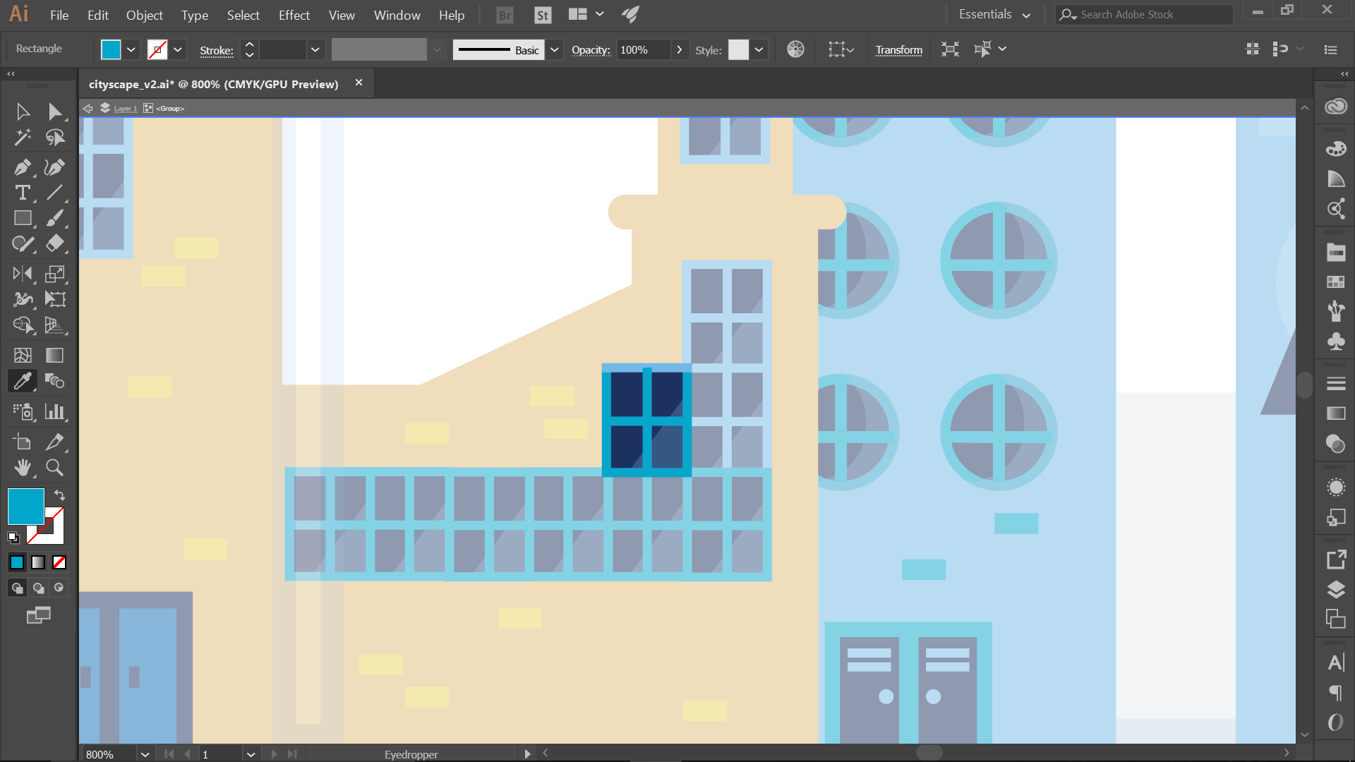
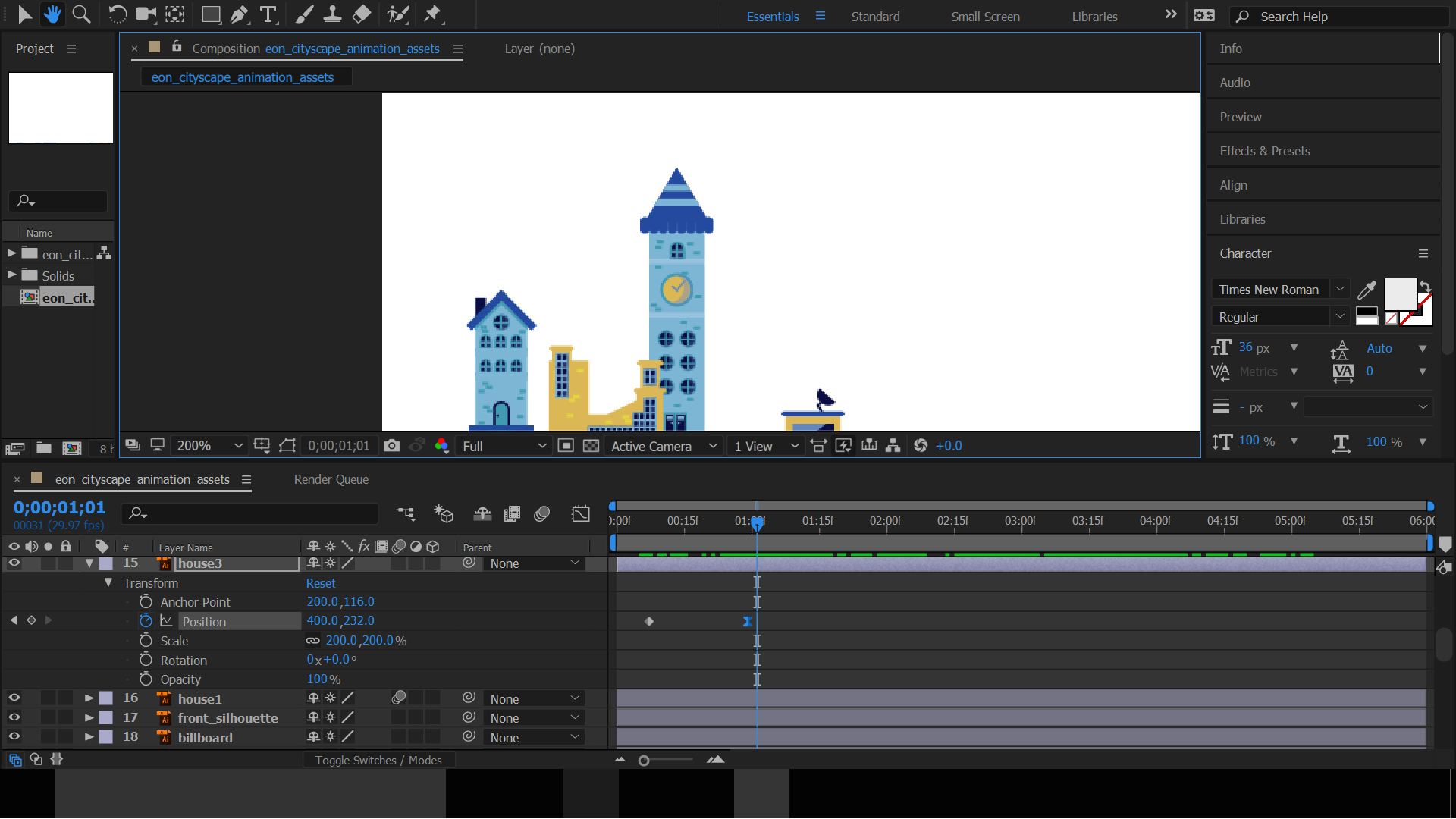
Taking a modern and minimalistic approach to Eon’s branding, we conveyed simplicity and ease-of-use. The wireframes and initial mockups below depict the local city skyline, drawing attention to a straightforward CTA to find mortgage rates.

Refining the message
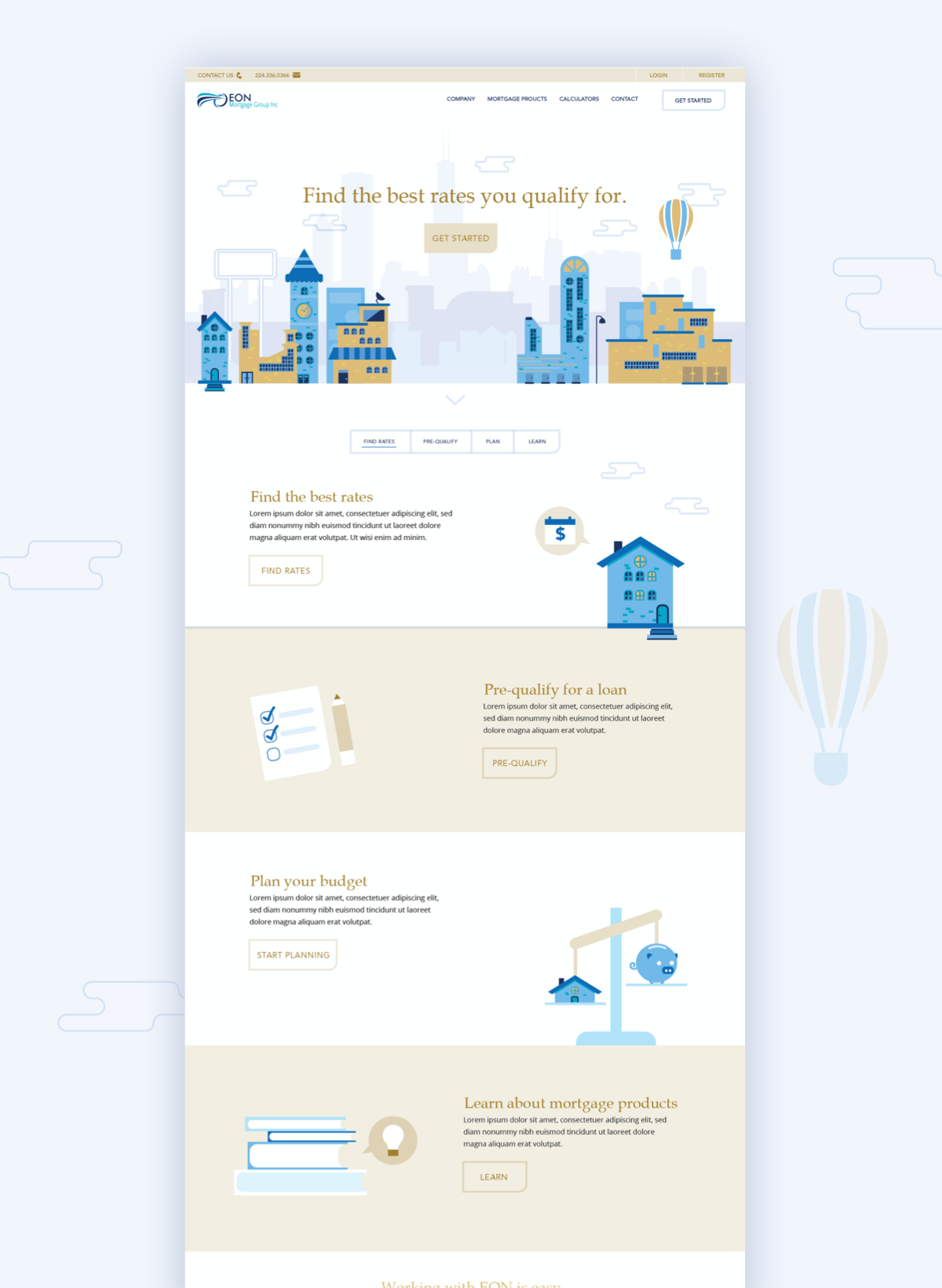
Iterating through a variety of style and messaging approaches, we found that Eon wanted to convey trust and longevity, despite wanting to appeal to younger audiences with a clean and simple aesthetic. To achieve this, we incorporated gold to represent trust and prestige, as well as a sans-serif font to give the headlines a sense of stability and a grounded feeling. And we topped it off with a clean animated skyline to give a sense of growth and working together to achieve mortgage goals.


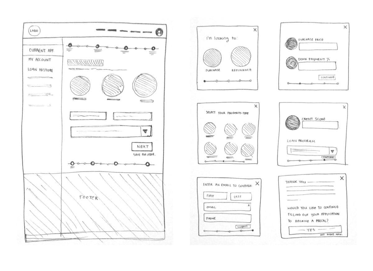
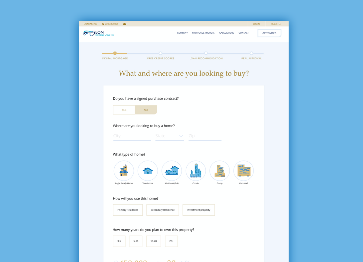
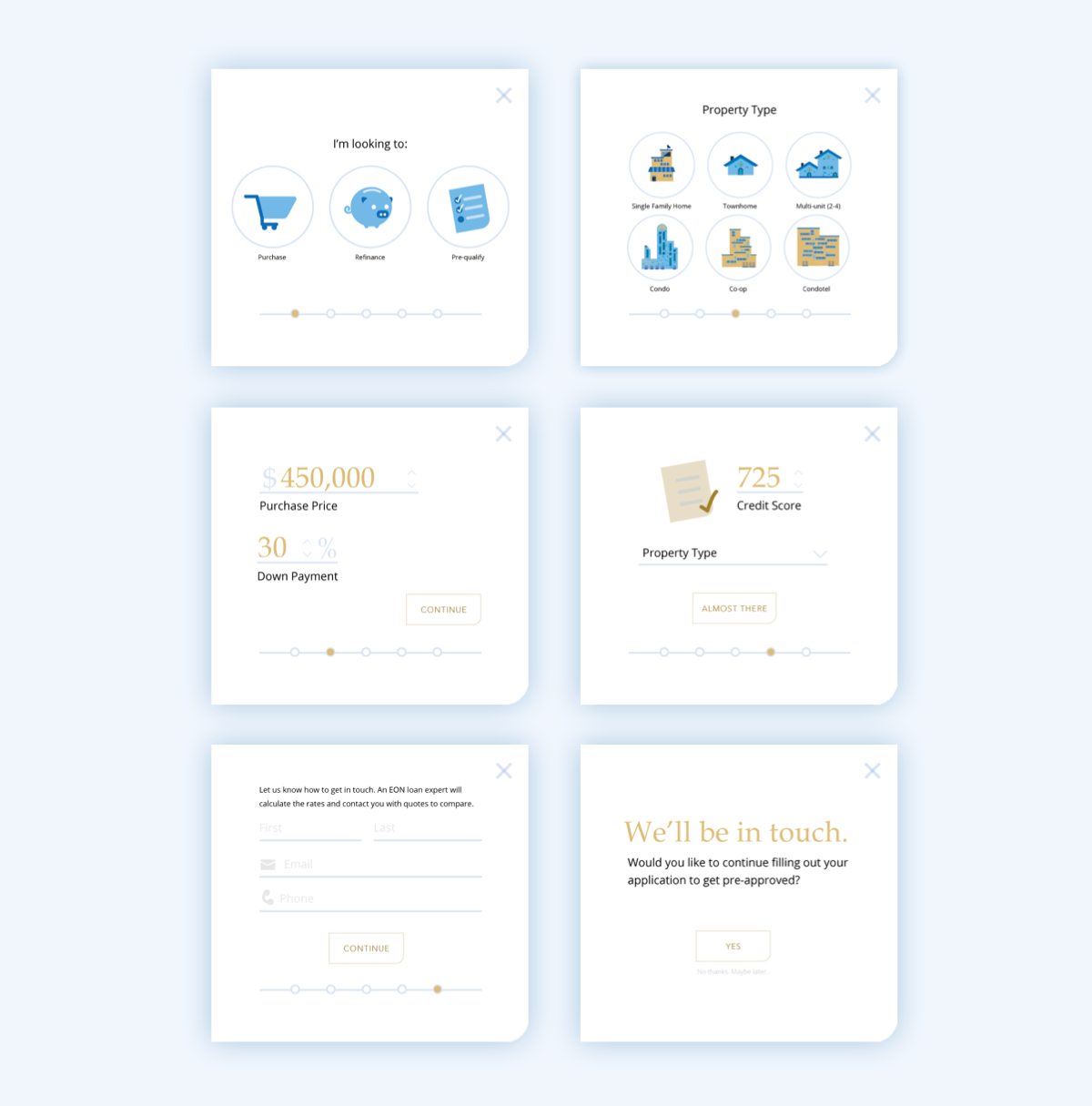
Simplifying verbose form design
Making long forms, which can often be 10+ screens on typical mortgage sites, simple and easy to navigate and process was a priority for Eon. To do this, we turned the prequalification form into a streamlined four step process.
One caveat we found across competitor forms was form fields not matching the easiest input type. Just as a "Yes / No" question didn't need to be a dropdown, a "Home Type" question didn't need to be ambiguous with undefined phrases. We made sure to choose simple input formats for small selections and two option questions and use toggle bars and text fields where appropriate. And we incorporated iconography and visual graphics to keep the user engaged and to minimize confusion over unfamiliarity with homes or the mortgage process.
Eon used the minimal required information from the user to begin an internal prequalification process. The rest would be handled once the client contacted the user directly as direct contact was the necessary next-step regardless of how much information the user provided. By taking this approach, we were able to shrink our input field quantity and form page quantity by half Eon's competitors, resulting in a simple and short process.
Looking forward
It was important to Eon to provide users with a sense of involvement and control in the process, rather than collecting a ton of information and then promising to pump out a number or approval letter on the other end. This way, they could understand each user’s individual goals and restraints in home-buying and build the foundation for a positive and open relationship through the remainder of the process.
As we collect user data and receive feedback and reviews, we will be asking ourselves:
- What actions do users not find intuitive?
- What information are users not exploring?
- What features would users like to see more of?
